Invasion 2022
/ Exhibition Identity
Visual Identity for the Berlin exhibition with Ukrainian artists photography.
First design version

1 — Starting point of design.
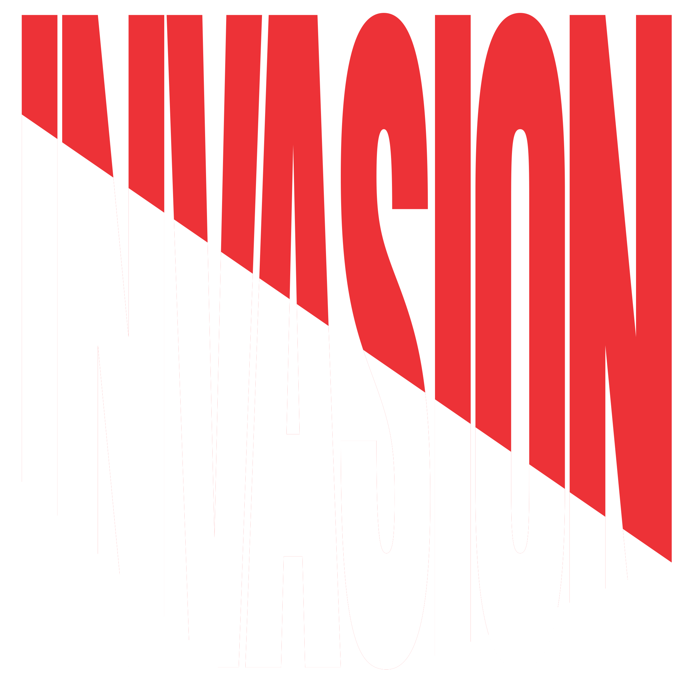
Invasion 2022
It is a rare success when a logo allows you to describe its purpose and main meanings without resorting to additional means and without going beyond its limits.
In this case, the name itself can carry a very visual history of the context and an allegory of the events that will be discussed. In a sense, it turns out to be a meta-history.
The symbolism is quite simple and clear. The invasion of an alien, aggressive red, Russian into the territory of Ukraine.
The sharpest and simplest version of the name design, among other things, looks like a guillotine.
The font style is deliberately stretched vertically for a more aggressive effect.
Graphically, the logo looks sharp, uncomfortable, powerful and can instill fear.
2 — The main logotype version.
Cuts
For a stronger graphic effect, you can discard the font part that has not been invaded by red.
Looks defiant, can ask additional questions, catches the eye, stimulates imagination and reflection.
Variable
opportunities
Use different variations of the logo in different situations and layouts.
Or use only one on all media.

3,4 - Auxiliary options


5,6 - Additional Variations

Набросок анимации
Логотип очень расположен для внутренней анимации.
7 — Черновой пример анимации логотипа.
Layout examples
A square poster is preferable to a rectangular one, but layout options can be anything, even horizontal ones.
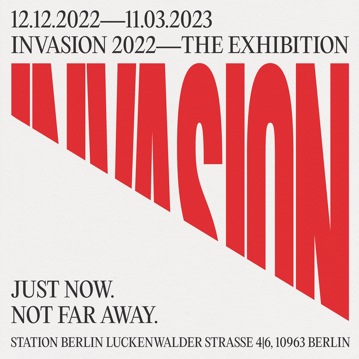
8 - Poster with the announcement.
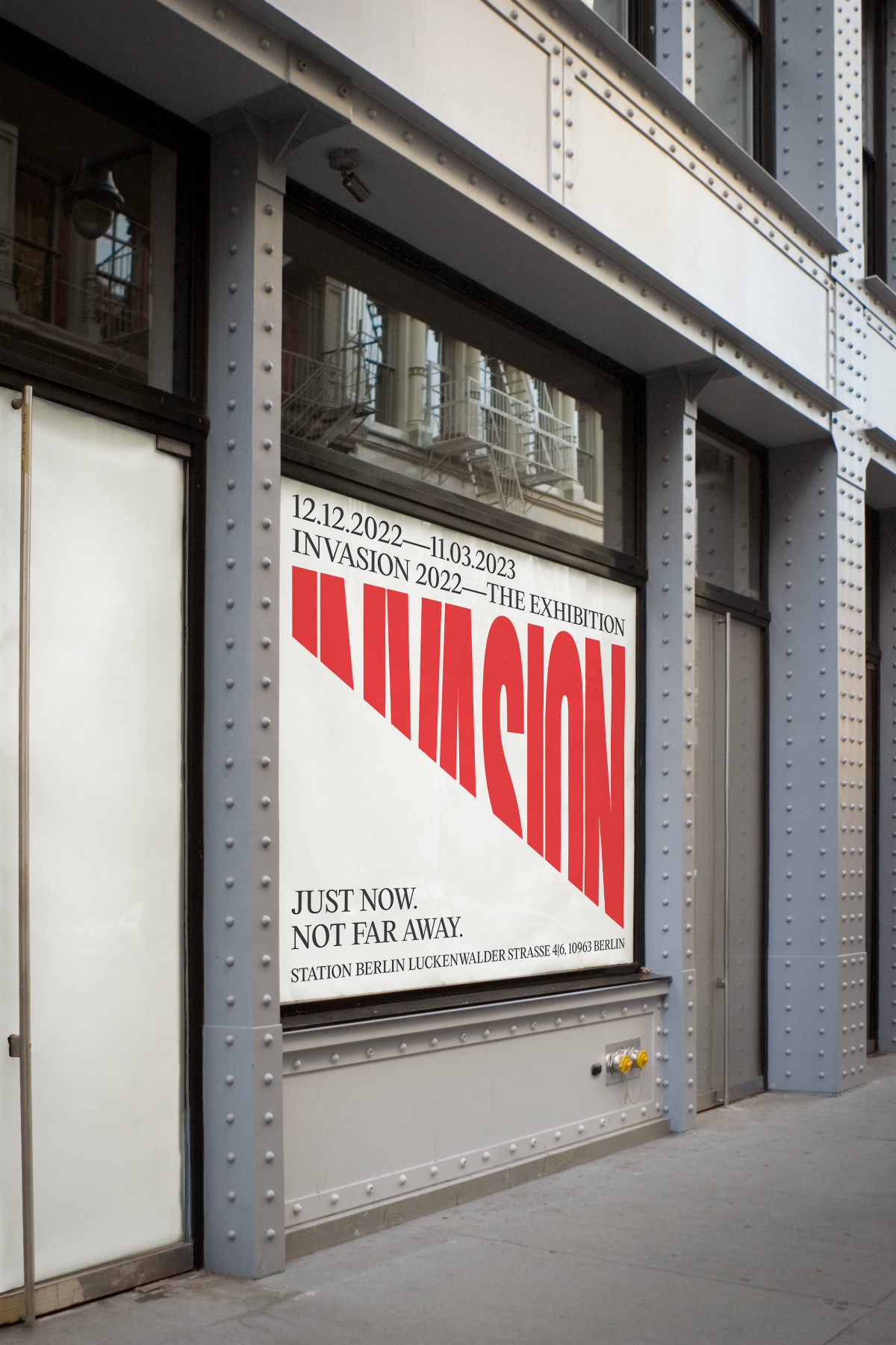
9 - An example of a printed poster in an urban environment.
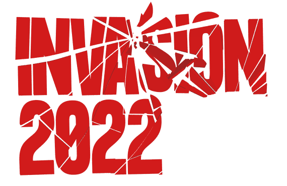
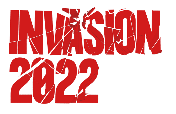
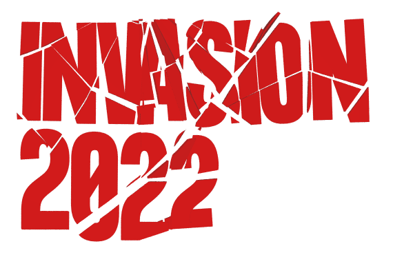
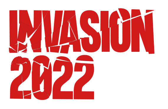
Second variation
Broken Glass
To begin with, several options with glass, in order to understand how the glass will behave when broken.
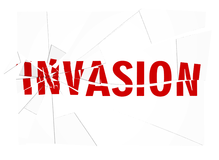
The first version of the typeface with one word in the title.
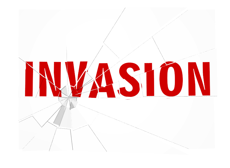
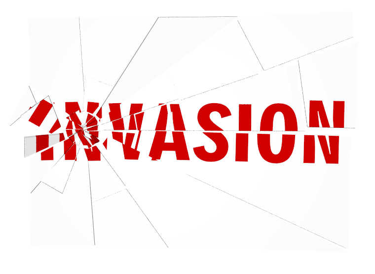
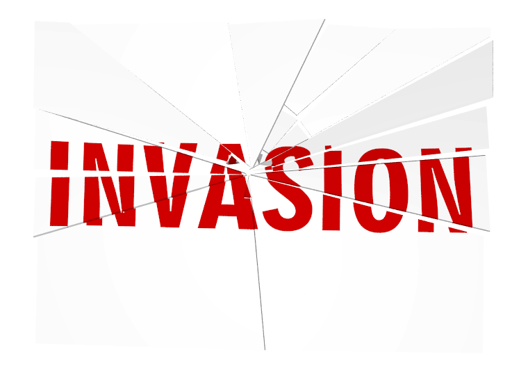
8 — Procedural glass breaker
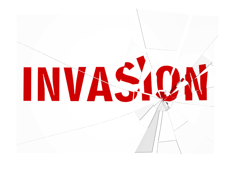
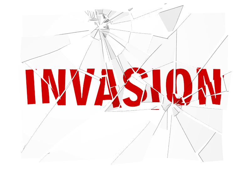
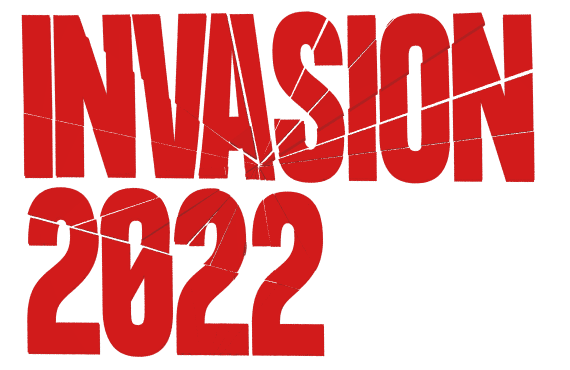
Options without glass
The first version of the font style with one word in the title.


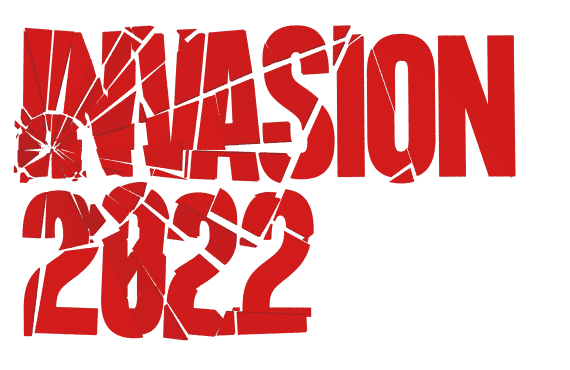
Second spelling
The second version of the title with the year within.
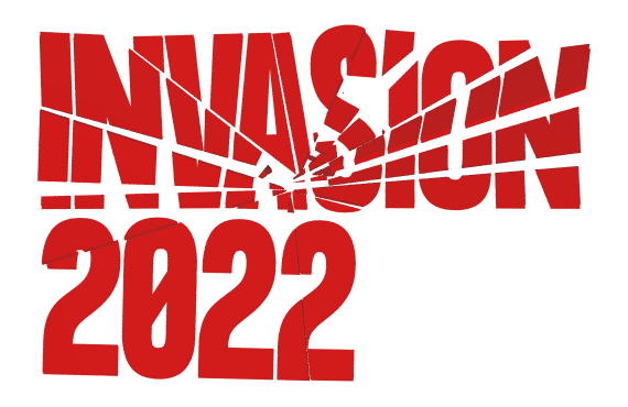
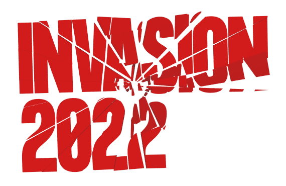
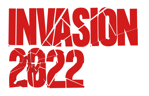
24 - The final version of the logo
30 — T-shirt
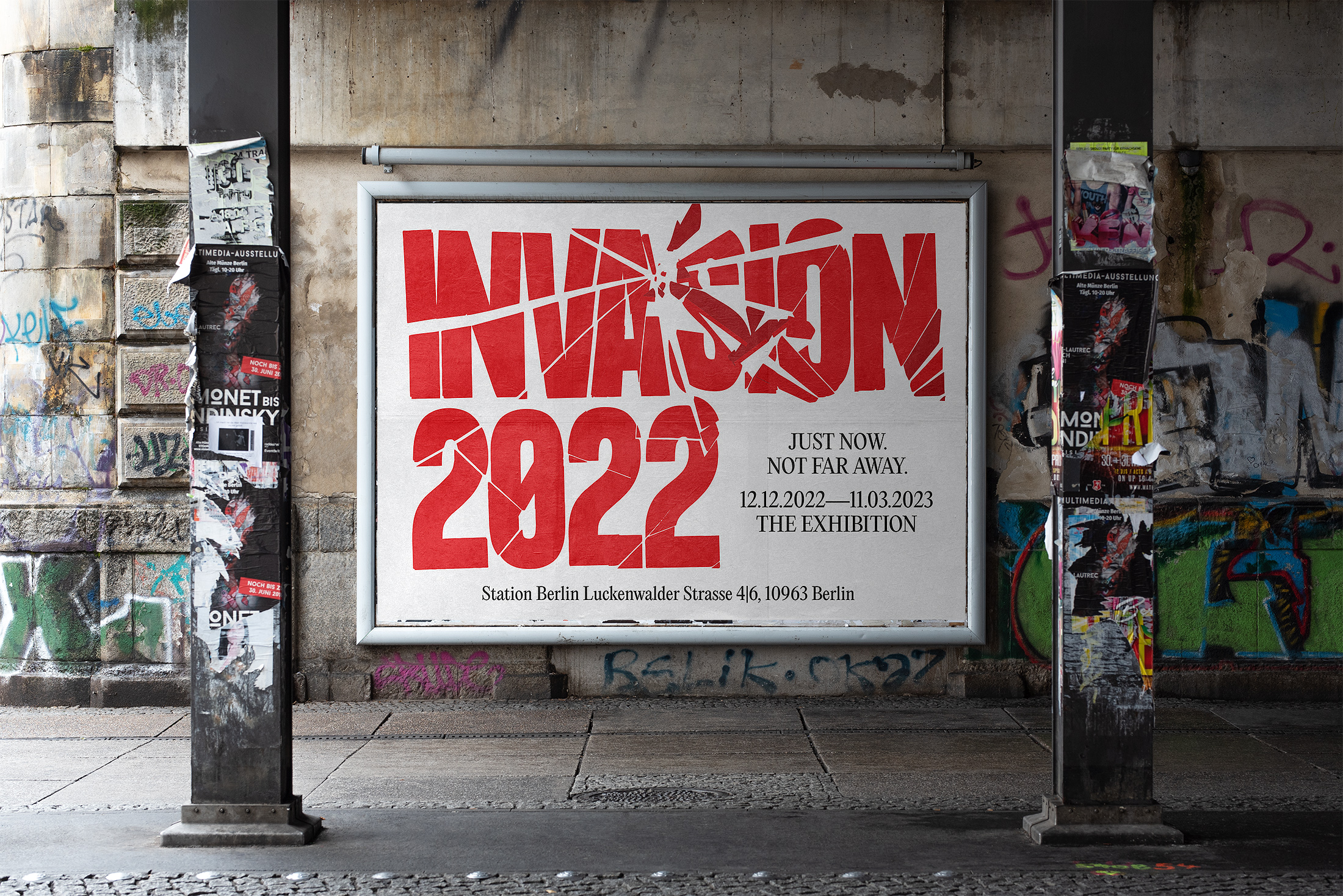
23 - Advertising poster in an urban environment